
American housing: Map of misery

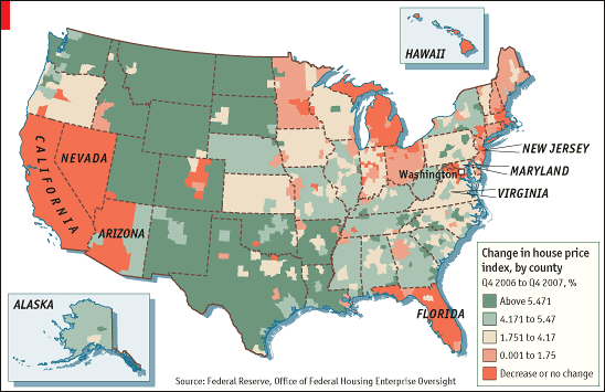
SOUNDING more like a cartographer than a central banker, Ben Bernanke this week showed off the Federal Reserve’s latest gizmo for tracking America’s property bust: maps that colour-code price declines, foreclosures and other gauges of housing distress for every county.
His goal was to show that falling prices meant more foreclosures, and to urge lenders to write down the principal on troubled loans where the house is worth less than the value of the mortgage. His maps—where hotter colours imply more trouble—also make a starker point. The pain of America’s housing bust varies enormously by region. Hardest hit have been the “bubble states”—California, Nevada and Florida, and parts of the industrial Midwest. The biggest uncertainty hanging over the economy is how red will things get.
The answer is not simple. It is hard to be sure how much house prices have fallen. America has several house-price indices and they tell different stories. Widely cited, but least useful, are monthly figures showing median home prices produced by the National Association of Realtors (NAR). These indicate that median prices are down some 13% from their peak, but since these averages do not adjust for the mix of homes changing hands, which fluctuates from month to month, they are inevitably distorted.
Mr Bernanke’s maps use figures from the Office of Federal Housing Enterprise Oversight (OFHEO). Its statistics have broad geographic reach and track repeat sales of the same house. The monthly national index suggests average prices have fallen only 3% from a peak in April 2007, and the quarterly figures are still positive. But OFHEO’s figures include only houses financed by mortgages backed by the government-sponsored giants, Fannie Mae and Freddie Mac. They leave out the top and bottom of the market—where prices rose fastest during the bubble and where the mortgage mess was most severe. Thus OFHEO’s figures probably understate the scale of the housing mess. Another set of indices, developed by Robert Shiller and Karl Case and produced by Standard & Poor’s (S&P), a rating agency, includes all types of houses and show house prices rising faster during the boom and falling faster now. Although the Case-Shiller figures are not perfect—they miss many rural areas—they are a better gauge of price declines in big cities.
Assessing how much further house prices are likely to fall gets even trickier. Investors expect a further 20% drop, judging by the prices of futures contracts linked to the Case-Shiller locity index. But the futures market is small and illiquid and may overstate the possible declines.
The discrepancy between supply and demand suggests that prices could fall a lot more. By historical standards there is a huge glut of unsold homes on the market. The homeowner-vacancy rate has soared to a record level of 2.9%: there are some 1.1m “excess” houses for sale compared with the average between 1985 and 2005. Although the inventory of new homes is falling as builders have slashed their production, the supply of homes for sale is being pushed up by foreclosures.

By most measures, prices are still above the levels implied by the fundamentals. Using a model that ties house prices to disposable incomes and long-term interest rates, analysts at Goldman Sachs reckon that the correction in national house prices is only halfway through. They expect an 18-20% correction overall, or another 11-13% decline from now. But their models suggest that six states—Arizona, Florida, Virginia, Maryland, California and New Jersey, could see further price declines of 25% or more.
Optimists point out that some measures of housing affordability have dramatically improved. According to NAR figures, monthly payments on a typical house with a 30-year mortgage and 20% downpayment were 18.5% of the median family’s income in February, down from almost 26% at the peak—and close to the historical average. But this measure is misleading, not least because credit standards have tightened. A survey of loan officers conducted by the Fed suggested on May 5th that 60% of banks tightened their lending standards for prime mortgages in the first three months of 2007. And, as Michael Feroli of JPMorgan points out, the affordability gauge depends on what measure of home prices you look at. Use the Case-Shiller index, where the affordability of housing worsened sharply during the boom, and mortgage payments are still high in relation to incomes.
A better measure of housing fundamentals is the relationship between house prices and rents. This is a sort of price/earnings ratio for the housing market: the price of a house reflects the discounted value of future ownership, either as rental income or as rent saved by an owner who lives in the house.
A recent analysis by Morris Davis of the University of Wisconsin-Madison, and Andreas Lehnert and Robert Martin of the Fed, shows that the rent/price yield in America ranged between 5% and 5.5% from 1960 to 1995, but fell rapidly thereafter to reach a historic low of 3.5% at the height of the boom. Given the typical pace of rental growth, Mr Feroli reckons house prices (as measured by the Case-Shiller index) need to fall by 10-15% over the next year and a half for the rent/price yield to return to its historical average. Again, that suggests the national housing bust is only halfway through. And, given the scale of excess supply, house prices are likely to overshoot. All told, the pressure on policymakers to help struggling homeowners is bound to increase.